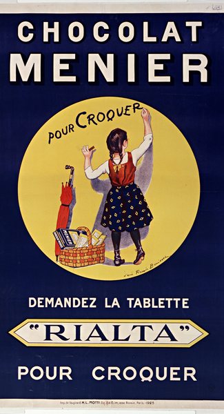
Chocolat Menier
Artist
Firmin Bouisset
1859–1925. Painter, illustrator, poster artist. Born in Moissac.
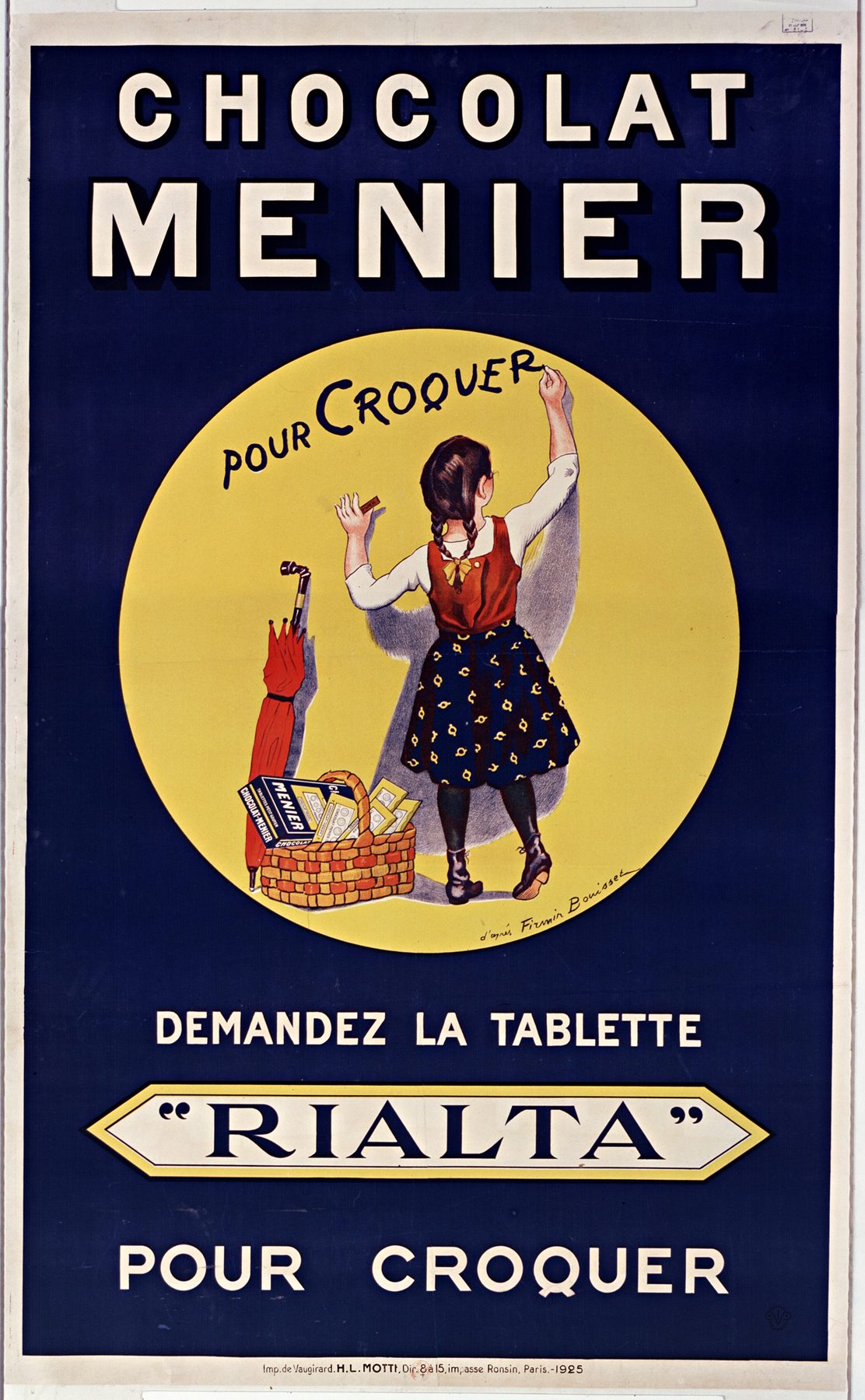
Bouisset was a painter and lithographer who became one of the best known advertising illustrators of his time. His little girl writing on a wall for Chocolat Menier, first published in the early 1890s and said to be modelled on his daughter Yvonne, became the face of the brand.
He also drew the schoolboy for LU Petit Écolier biscuits. The 1925 Rialta poster is credited "after Bouisset": his girl, reused, with new lettering by the printer's studio.
- After Firmin Bouisset
- 1925
- Art Deco
- France
- Wide sans, Shadow and outline, High-contrast serif, Script
- Imprimerie de Vaugirard, Paris
- 194 × 125 cm
- Bibliothèque nationale de France
- Gallica btv1b9005851x
- Wikimedia Commons
- Public domain
Fonts
Wide Shadow

Letters from the poster

Full typeface
Lettering style
Download
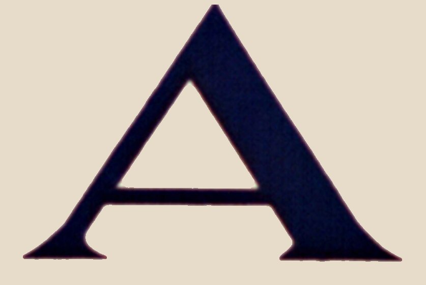
Lozenge Serif

Letters from the poster
Full typeface
Lettering style
Download
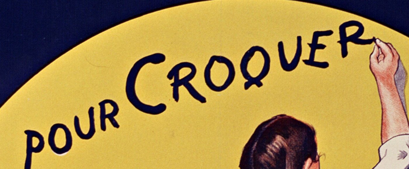
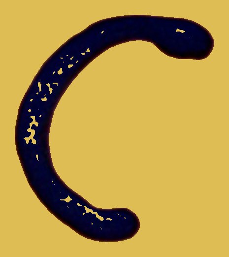
Chalk Script
Letters from the poster
Full typeface
Lettering style
Download
History
Menier was one of the largest chocolate makers in France, with a model factory at Noisiel, east of Paris. In the early 1890s Firmin Bouisset drew a little girl chalking the brand name on a wall, and Menier kept reusing her for decades.
This version from 1925 sells a new bar, Rialta, made “pour croquer”: for eating as it is, rather than for cooking. The girl is Bouisset’s. The lettering is not. It came from the printer’s studio at the Imprimerie de Vaugirard in Paris, and nobody signed it.
That makes it an unusually rich sheet. Three distinct letterforms share the sheet: a wide, shadowed sans for the brand, a high-contrast serif for the product, and a casual chalk script that the girl is writing as you look.
Source and rights
Firmin Bouisset died in 1925, and the lettering is unsigned studio work published the same year. Both routes end in the same place: the public domain since 1 January 1996.
Scan from Wikimedia Commons, catalogue record Gallica btv1b9005851x. Brand names on the poster belong to their owners and are never used as font names.
Related posters
Same era, lettering or artist.