Artists
Every letter here began as poster lettering for the street. Painters and commercial artists drew type for brands, shows and shop windows. Open a name to see their fonts. Sorted by year of birth.
F. G. Delamotte
- 1814–1862
- England
- Engraver, alphabet compiler
- Since 1933
- Wikidata
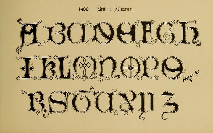
Freeman Gage Delamotte collected and engraved alphabets for draughtsmen, masons, painters and lithographers. His books were reprinted through the second half of the nineteenth century.
The plates show full A to Z sets in one alphabet. That is rare on posters, and it is why the books matter here as sources, not as decoration samples.
Jules Chéret
- 1836–1932
- Paris
- Lithographer, poster artist
- Since 2003
- Wikipedia
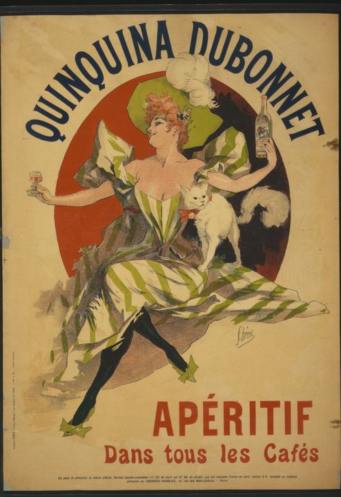
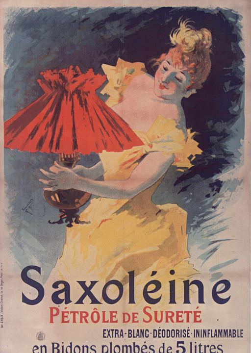
Chéret was apprenticed to a lithographer at thirteen. He spent the early 1860s in London designing labels and book covers, then returned to Paris in 1866 and opened his own lithographic press.
Working directly on the stone, he drew image and lettering together in a few flat colours. His posters filled Paris walls for three decades and earned him the label “father of the modern poster”. His lettering is loose, condensed and confident, made to be read across a boulevard.
Firmin Bouisset
- 1859–1925
- Moissac
- Painter, illustrator, poster artist
- Since 1996
- Wikipedia
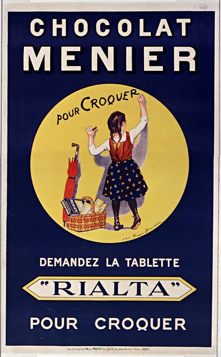
Bouisset was a painter and lithographer who became one of the best known advertising illustrators of his time. His little girl writing on a wall for Chocolat Menier, first published in the early 1890s and said to be modelled on his daughter Yvonne, became the face of the brand.
He also drew the schoolboy for LU Petit Écolier biscuits. The 1925 Rialta poster is credited "after Bouisset": his girl, reused, with new lettering by the printer's studio.
Lucien Métivet
- 1863–1932
- Paris
- Illustrator, poster artist
- Since 2003
- Wikipedia
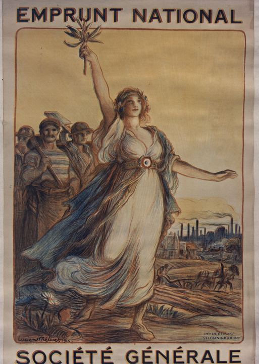
Métivet trained in Paris and worked as an illustrator for magazines and books. He also drew posters for theatre and for public campaigns.
His 1920 Emprunt national sheet for Société Générale sets EMPRUNT NATIONAL and SOCIÉTÉ GÉNÉRALE in the same bold outlined capitals over a figure of France.
Henri de Toulouse-Lautrec
- 1864–1901
- Albi
- Painter, lithographer, poster artist
- Since 1972
- Wikipedia
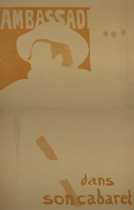
Toulouse-Lautrec moved in the cabaret world of Montmartre and made posters for the Moulin Rouge, the Divan Japonais and Ambassadeurs.
On the Aristide Bruant sheets the name is knocked out of a flat colour block in heavy irregular capitals, with a softer lowercase line underneath.
Edward Penfield
- 1866–1925
- Brooklyn, New York
- Illustrator, poster artist
- Since 1996
- Wikipedia
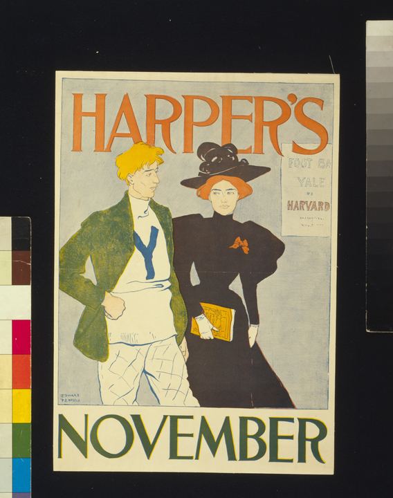
Penfield studied at the Art Students League and became art editor at Harper’s. From the mid-1890s he designed a poster for each monthly issue.
The sheets use flat colour, strong outlines and hand-drawn serif capitals. HARPER’S and the month name carry the whole message.
Koloman Moser
- 1868–1918
- Vienna
- Painter, designer, Secession artist
- Since 1989
- Wikipedia
Moser helped found the Vienna Secession and later the Wiener Werkstätte. He designed furniture, glass, books and posters.
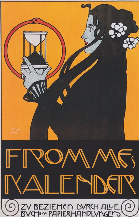
Frommes Kalender (1899) stacks FROMMES KALENDER in tall outlined capitals under a figure with an hourglass. The letters are built from repeated vertical strokes.
Leonetto Cappiello
- 1875–1942
- Livorno, Italy
- Caricaturist, poster artist
- Since 2013
- Wikipedia
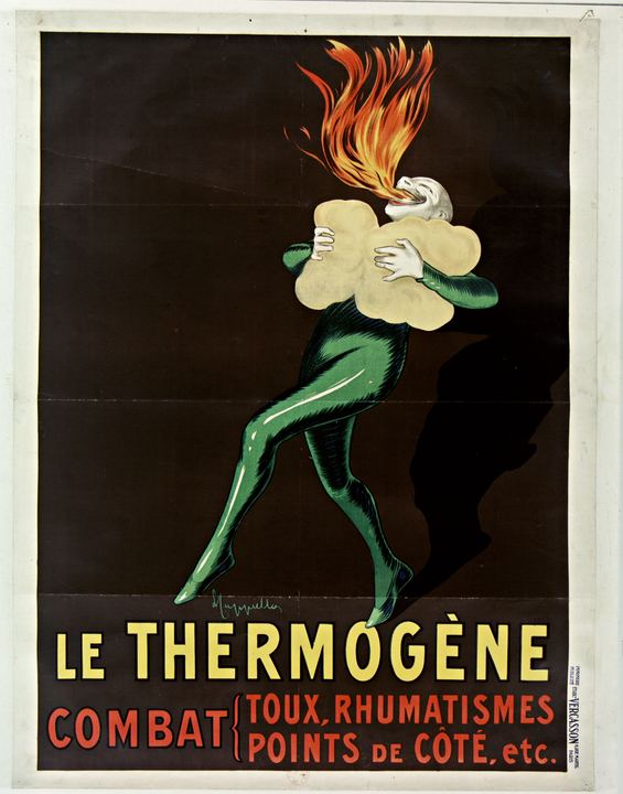
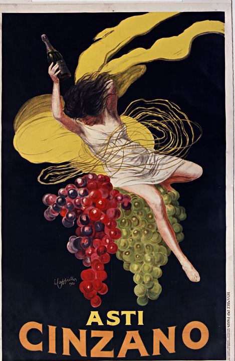
Cappiello moved to Paris in 1898 and made his name as a caricaturist. He turned to posters soon after and signed a long contract with the printer Vercasson, later moving to Devambez.
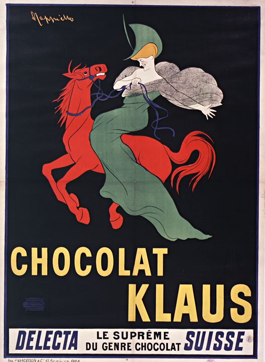
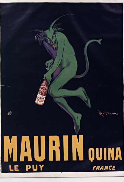
His formula was a single striking figure, often unrelated to the product, set against a flat black or coloured ground. Chocolat Klaus in 1903 is usually named as the breakthrough. The lettering on his posters is plain, condensed and loud, which is exactly what makes it useful as type.
Hans Rudi Erdt
- 1883–1918
- Benediktbeuern, Bavaria
- Plakatstil designer
- Since 1989
- Wikipedia
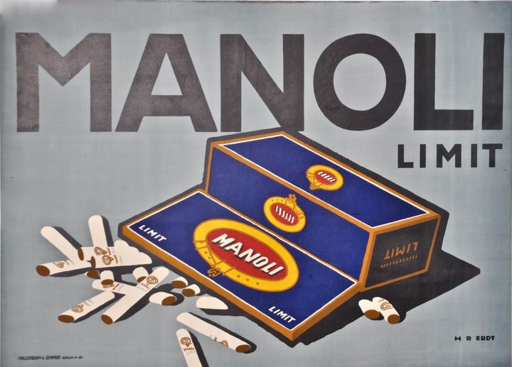
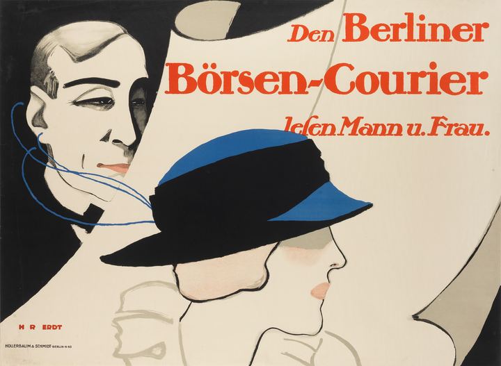
Erdt trained in Munich and moved to Berlin around 1908, where he worked closely with the printer Hollerbaum & Schmidt. With Lucian Bernhard, Julius Klinger and Julius Gipkens he shaped the Plakatstil, or object poster.
His posters for Opel, Manoli and Problem cigarettes reduced the message to a product and a word. He drew his letters himself, from geometric capitals to soft, bouncy serifs.