
Posters
Every poster, grouped by era. Within each era, titles run A to Z. Filter by era, country, lettering style or artist.
Nothing matches these filters yet.
Belle Époque
Paris invents the modern colour poster, and draws its letters by hand on the stone.
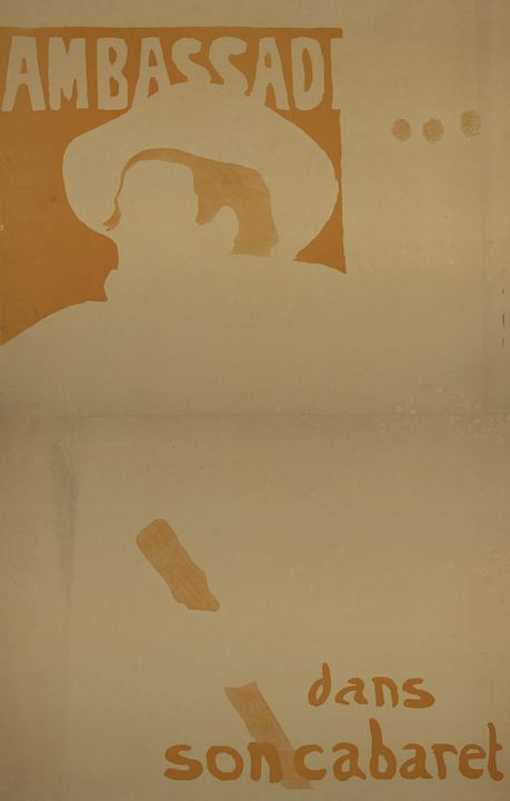
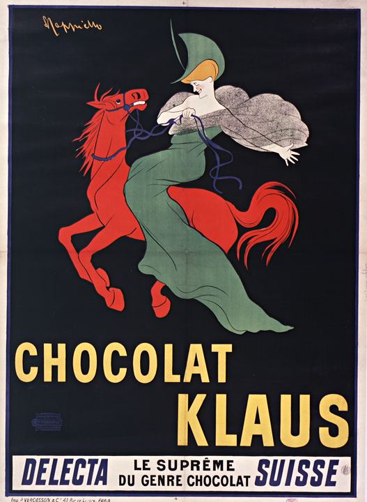
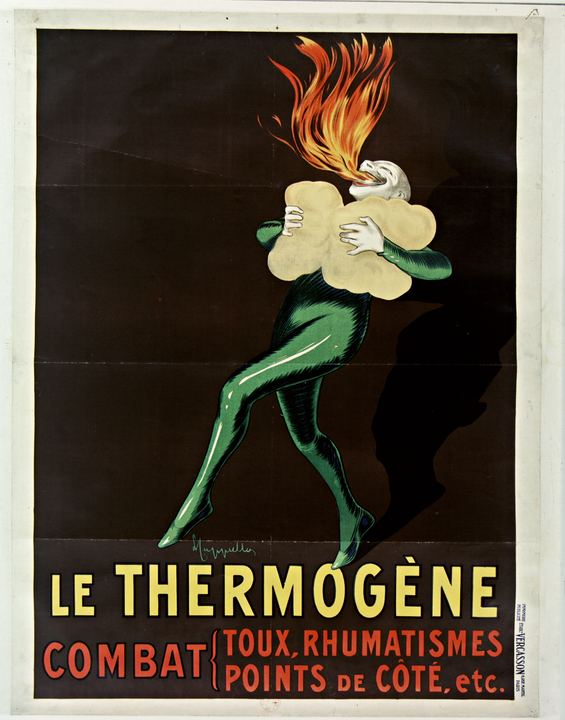
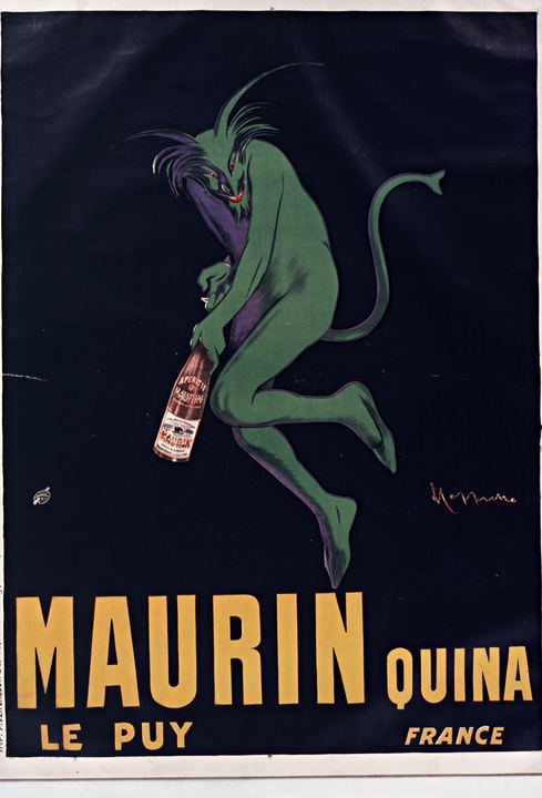
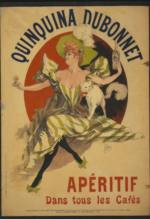
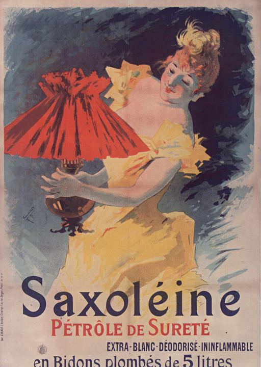
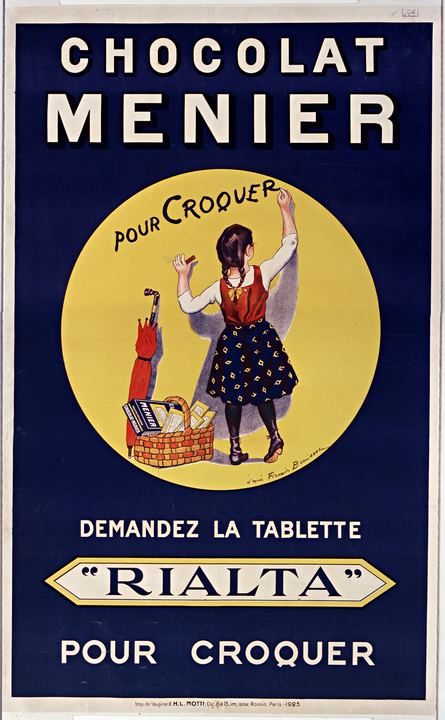
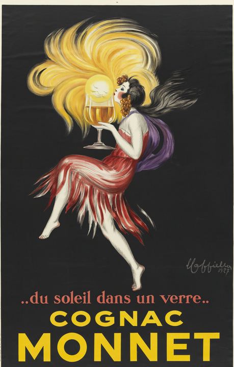
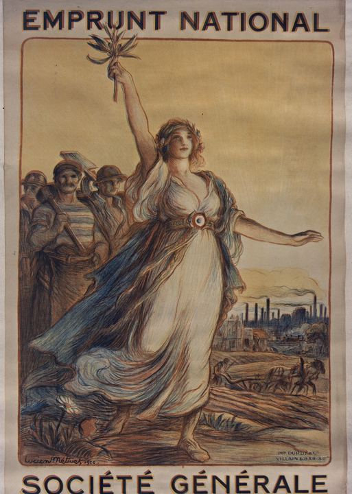
From the 1880s to the First World War, French printers such as Chaix, Vercasson and others covered Paris with colour lithographs. The image carried the mood. The lettering carried the name, the claim and the product.
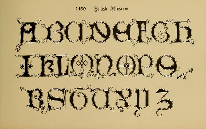
Artists like Jules Chéret and Leonetto Cappiello drew figure and type together. Capitals are often condensed and loud so a long brand name fits across a boulevard. Scripts and italics sit under them as strap lines. Almost none of that lettering was ever made into a typeface. Most of it stayed on one stone for one job.
Art Nouveau
Whiplash curves and plant ornament, where the lettering often grows out of the drawing.
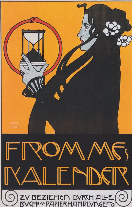
Art Nouveau ran through posters in Paris, Brussels, Vienna and beyond around the turn of the century. Ornament was the point: vines, hair, smoke and frames that looped into the text.
That is also why so little of it becomes a usable font. When the letters only work wrapped in the illustration, they stay on the poster. Ghost Foundry keeps the sheets where the letterforms can stand alone: clear genre, bold enough to read, incomplete alphabet or not.
Plakatstil
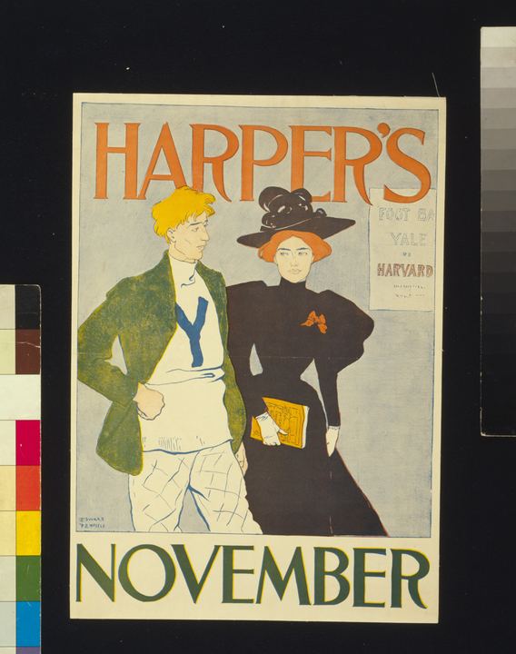
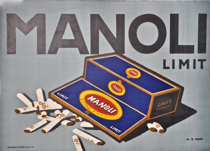
Berlin’s object poster: one product, one brand word, flat colour, nothing else.
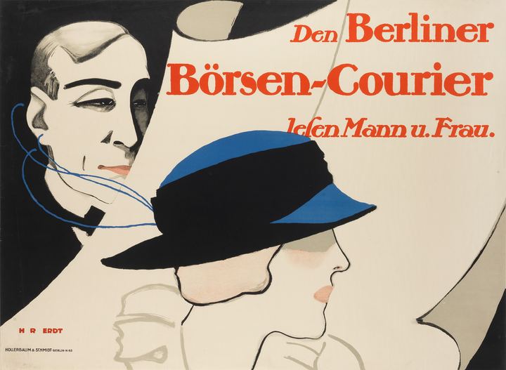
In the years before the First World War, Berlin designers such as Lucian Bernhard, Hans Rudi Erdt, Julius Klinger and Julius Gipkens cut the crowded Belle Époque scene down to a single object on a flat ground. The printer Hollerbaum & Schmidt put many of those sheets on the street.
The lettering is the other half of the idea. Geometric sans capitals, soft serifs and short brand words drawn to match the product. No decoration for its own sake. The style is sometimes called the Sachplakat, the object poster, and it is one of the clearest sources of display type that was never released as a font.
Art Deco
Streamlined, geometric display letters for a machine-age high street.
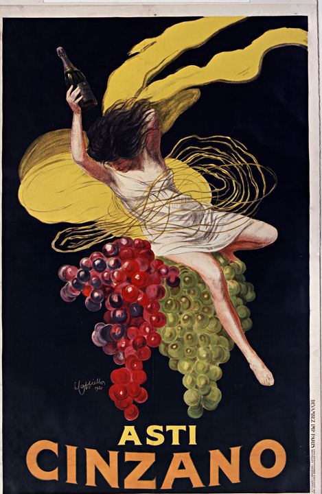
Between the wars, Art Deco lettering took the geometry of modern life into shop fronts, travel posters and product sheets. Circles, straights, high waists, shadows and outlines. Letters meant to look fast even when they stood still.
Paris, New York, London and Berlin each had a local accent, but the shared habit is clear: display first, text second. Wide sans, high-contrast serifs and shadowed capitals show up as brand names that were drawn once and never cut as type. Those are the sheets Ghost Foundry looks for.
Know a poster?
Public-domain poster, bold lettering. That is the short version.
Send a link to the archive record through Contact.